Litha Vineyard

A creative case study by H Designs
A South African Wine Brand Rooted in Nature and Storytelling
Bringing the Essence of South Africa into Every Pour
Litha Wine began as a passion project — one rooted in place, people, and purpose. I was living just 20 minutes from this family-run vineyard in the Western Cape, and was immediately drawn in by its golden hillsides, friendly team, and the effortless magic of the setting. I’d often work right on the property, surrounded by blooming flowers, birdsong, and the scent of ripening grapes drifting on the breeze.
The vineyard had a story to tell — one shaped by nature, heritage, and hospitality. They were especially fond of the protea, South Africa’s national flower, which grew wild along their borders. It became the heart of the brand: a symbol of resilience, beauty, and rootedness. From that inspiration, we began to build something more than just a label. We created a brand experience that felt as vibrant, grounded, and memorable as the place itself.

A Label That Felt Like Home
The Litha team didn’t come with a lengthy brief — just a heartfelt request:
“We want it to feel like us. Grounded in South Africa. Natural. Elegant, but not stuffy. Something that celebrates our roots and the land we love.”
They dreamed of a label and brand identity that felt hand-touched and personal. Their only non-negotiable? The protea had to be front and center — not just as a symbol, but as a statement of pride and place.
I started with pencil sketches — exploring different ways to capture the protea’s texture, movement, and quiet strength. The logo evolved naturally from those illustrations, pairing a soft serif wordmark with organic sunburst lines and earthy tones pulled straight from the vineyard.

Bottling the Litha Experience
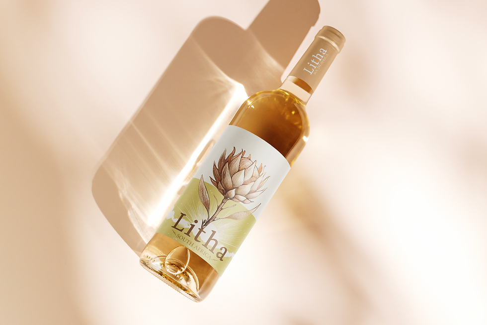
The packaging was where everything came together. I wanted each bottle to feel like a keepsake — something you’d want to gift, photograph, or simply admire on a countertop.
The label wraps delicately around the bottle, featuring a hand-illustrated protea layered over radiant sunbeams — a nod to the golden hours over the vineyards. Paired with soft earth-toned hills and a minimalist color palette, the design feels modern and rooted in nature at the same time.
For their premium collection, I extended the identity into a custom wooden wine box. The goal was to create something tactile and personal, while still feeling elevated and intentional. The box design mirrors the label, bringing in the protea and sunburst motif — this time etched into the surface for added texture and permanence.
It was more than just packaging. It became part of the full tasting experience.


Tour the Region from Your Screen
Once the logo, packaging, and storytelling were in place, the next step was translating Litha’s spirit into a digital space. The goal was to create a website that felt just as warm, grounded, and elegant as the bottle in your hand.
The site design pairs minimal layouts with textured backgrounds, soft sunlit gradients, and touches of hand-drawn elements — echoing the protea sketch and earthy tones used across the label and box.
We designed it to feel immersive, like walking through the vineyard itself.
Beyond visuals, the site was built for storytelling. Each page gives visitors a taste of Litha’s values — sustainability, slow living, and celebration — while guiding them easily to learn more or place an order.

From a Label to a Lifestyle
The design system included more than just packaging and web. Print-ready postcards, Instagram content, and tour guide inserts were also conceptualized to expand the Litha experience. These deliverables create brand cohesion across physical and digital touchpoints — from the vineyard to the inbox.


A Small Project with a Rich Finish
This brand sprint for Litha Vineyard was more than just an exercise in design — it was a deep, joyful dive into storytelling, local culture, and the emotional world of a wine brand. From the first visit to the vineyard to the final mockups of wine boxes and lifestyle merch, every piece was created with care, calm, and curiosity.
What started as a sketch of a Protea flower became a full expression of Litha’s identity — soft, sun-kissed, and rooted in South African beauty. Working just a short drive away from the vineyard made the creative process feel personal. The aroma of the vines, the earthy palette, and the warm hospitality all made their way into the visual system, from cork to canvas tote.
The final result? A brand that doesn’t just live on the label — it lives in the tasting room, on the shirt of the person pouring, in the social feed, and even in your picnic basket.
Why This Project Mattered
Litha was the kind of client work that reminds me why I love what I do:
-
A passionate local business
-
A beautiful product and story
-
A creative brief with room to grow
-
And most importantly, trust
This wasn’t about flashy gimmicks or tech tricks — it was about grounding a brand in feeling and place. The Protea wasn’t a trend — it was a symbol. The textures weren’t random — they were real. And the final designs weren’t just pretty — they were purposeful.
Let's Create Something Together
If you're a small business with a strong story — but no time, team, or clear brand vision yet — I’d love to help bring it to life.
Thoughtful. Fast. Budget-conscious. Collaborative.
Get in touch, and let’s plant the first seed of something beautiful.
-Lizmar Hilton
H Designs