OTTERLY DELICIOUS

A creative case study by H Designs
How an otter-obsessed coffee brand turned sustainable caffeine into a visual playground.
From Sketch to Sip: The Story Behind Otter Brew
A few months ago, I started dreaming up a fictional cold brew brand — something playful, a little cheeky, and rooted in sustainability and storytelling. What started as a simple packaging concept turned into a full-on creative passion project I didn’t want to put down.
Enter: Otter Brew — a canned cold brew coffee that celebrates the joy of small moments, a love for animals, and the kind of branding that makes you smile before your first sip.
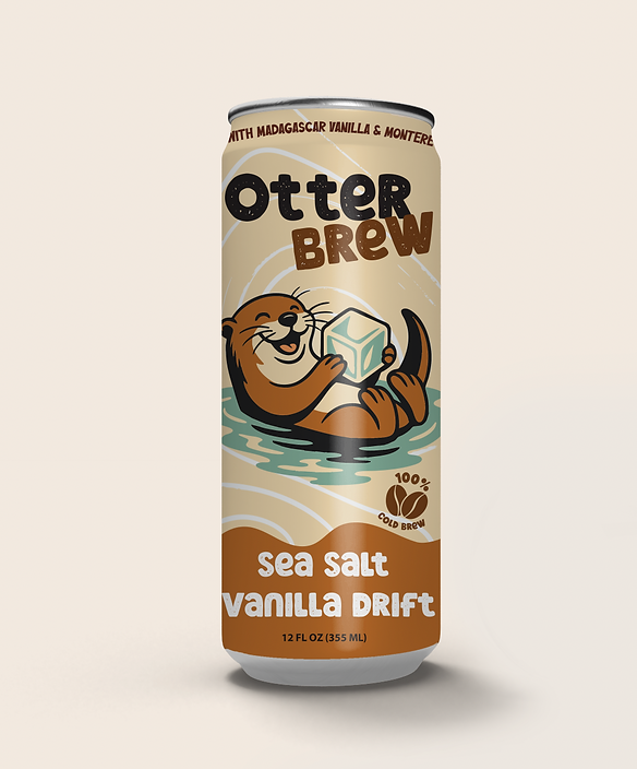
I imagined it as a line of smooth, flavor-forward cold brews that felt like a treat, but looked like a collector’s item. Each can features a lovable otter doing what otters do best — floating, snacking, chilling — but with a coffee twist.


From the start, I knew I didn’t just want a nice-looking label. I wanted a world. Something people could connect with. A character they’d look forward to seeing on the shelf. A vibe that felt equal parts nostalgic and fresh.
I started with illustration — one otter, holding an ice cube like a prized possession. From there, the concept snowballed. Different flavors got their own personalities. The otter became a mascot. A brand voice emerged: cheeky, comforting, clever.
The visual system was built around warm vintage tones, creamy backgrounds, and a bold logotype with personality. Every detail — from the swirl in the water to the flavor names like “Sea Salt Vanilla Drift” — was crafted to feel fun, intentional, and a little indulgent.
“We want people to smile when they see it — and then take a second look and see the mission behind it.”
What We Created (and How It Came Together)
In the end, Otter Brew became a full-scale visual concept with:
Three unique can designs featuring illustrated otter moments
Custom character artwork tailored to each flavor’s vibe
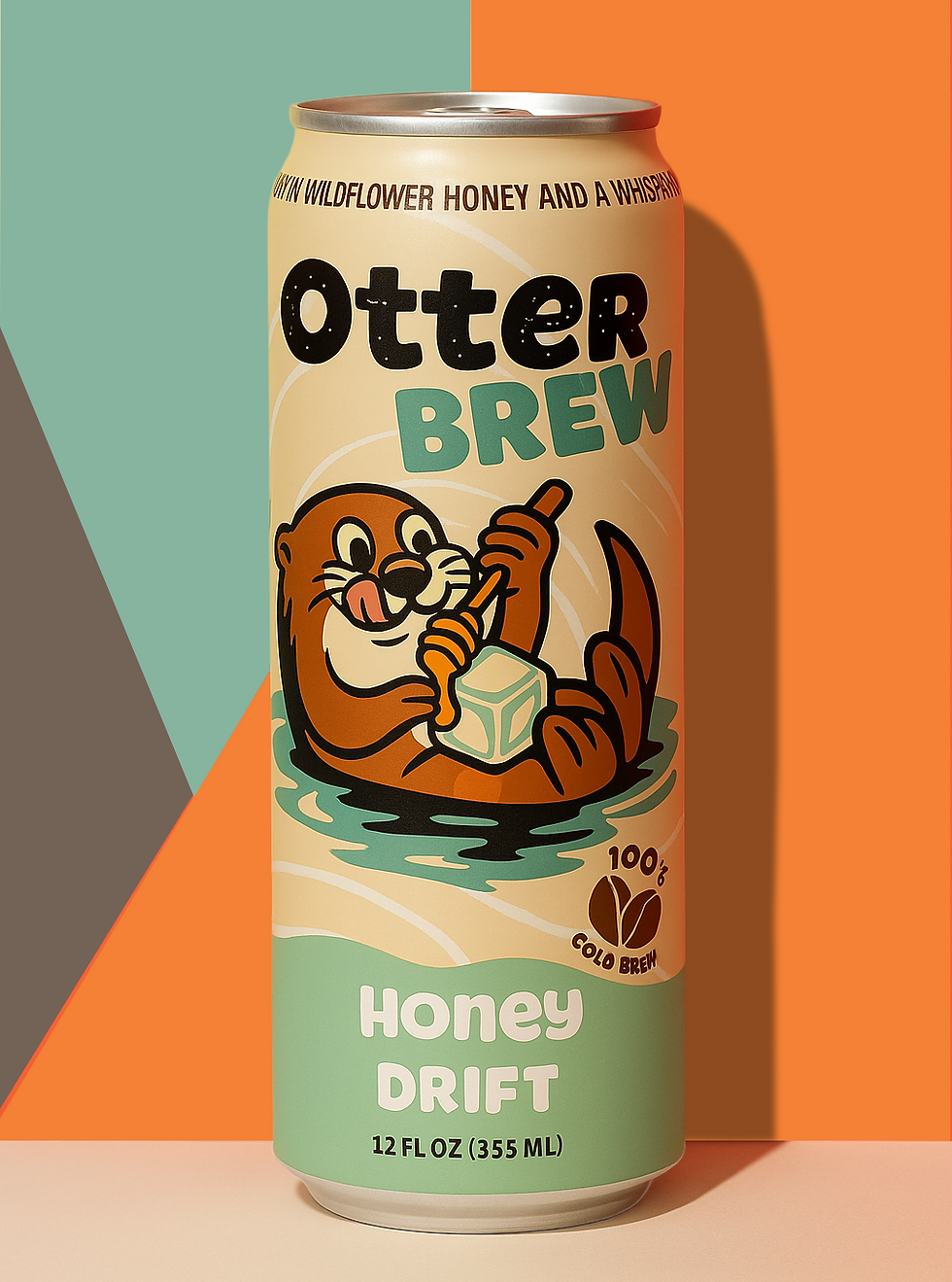


Honey Drift – featuring a honey dipper mid-drizzle
Sea Salt Vanilla Drift – the original, playful and comforting
Lavender Latte – a serene sniff of floral calm
These bold, stylized AI-generated shots placed each can in sharp, minimal environments — saturated backdrops, punchy lighting, and graphic shadows. They evoke the look and feel of real product photography, without ever stepping into a studio. After generating the core visuals, I finished each image in Photoshop to add polish and realism. The result? Eye-catching assets perfect for clean social media posts, mockups, and print layouts — all while keeping the production footprint lean.
A wrap-around label design with ingredients, brand story, nutrition, and a fun otter fact (yes, they really do hold hands when they nap)

All of it came together using a blend of illustration, layout design, vector work, and mockup polish — plus a sprinkle of AI-assisted concept exploration when needed.
Snatched from the Stream” Animation
To launch the campaign, we created a short, whimsical animation featuring the Otter Brew can resting on a mossy log as otters swim playfully in the background. It’s a nod to the brand’s riverside roots and nature-inspired charm. The gentle motion and warm setting added life and personality to the product, turning a still can into a story—and giving Otter Brew a scroll-stopping visual for social and digital promos.

Pattern Graphics
We designed a seamless background pattern inspired by Otter Brew’s playful label — complete with coffee beans, swirling lines, floating cans, and our happy otter mascot. Perfect for social story slides, branded packaging, or even merch down the line, it’s a versatile graphic element that brings the brand’s personality to life, over and over again.

A Little Brew, a Lot of Impact
This entire creative sprint came together in under 10 hours — from playful concepting and illustrations to animated moments and branded pattern work. The tools moved fast, but what made it work was clear direction, shared creative vision, and a lot of heart.
The final delivery wasn’t just cute — it was usable, cohesive, and full of character. From label design to social-ready visuals, Otter Brew now has a voice and a look that can grow with the brand.
Why This Project Matters
Otter Brew was everything I love in a project:
A playful brand, a strong visual idea, and the freedom to build something fun and functional from the ground up. AI didn’t replace the creative process — it supported it. It gave life to a vision that was already bubbling up, and helped translate it into design assets that felt rich, warm, and ready for the real world.
This wasn’t just about launching a cold brew. It was about building a brand that could float, swim, and splash into people’s lives — with style.
Let’s Make Something Together
If you’re a small business with a product you believe in — but no time or team for a massive campaign — this kind of creative process might be just what you need.
Thoughtful. Fast. Collaborative.
Whether you’re brewing something bold or launching something fresh, let’s bring it to life — with strategy, personality, and a touch of otter-like charm.
Thanks for reading,
Lizmar
H Designs
